Looking at Home Colour Trends for Spring 2015


When the “colours of the season” are determined, they are influenced by art and culture, the natural and man-made world, even socioeconomics and politics.
You may be surprised to hear that so much goes into how we see, and use colour – as such, the colours we choose in our homes have a great impact on how we feel as we live in that space. That’s why, when you go into your local paint shop to find “white”, you have seemingly infinite options, from “Seashell” to “Baby Powder”.
While you may turn over your wardrobe every season to stay on-trend with colours hot off the runways of Paris and Milan – what about your home?
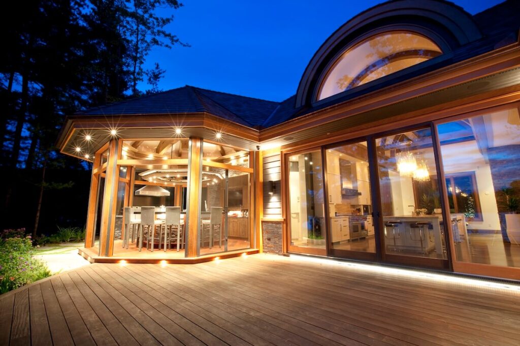
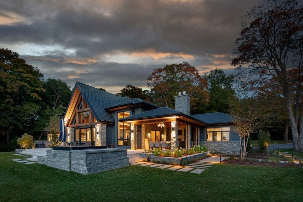
We’re not suggesting that you change your bedroom wall colour as often as you might change your shoe style each season. Rather, consider how a change in colour could dramatically bring a brand new design, personality and vibe to the spaces in your home.
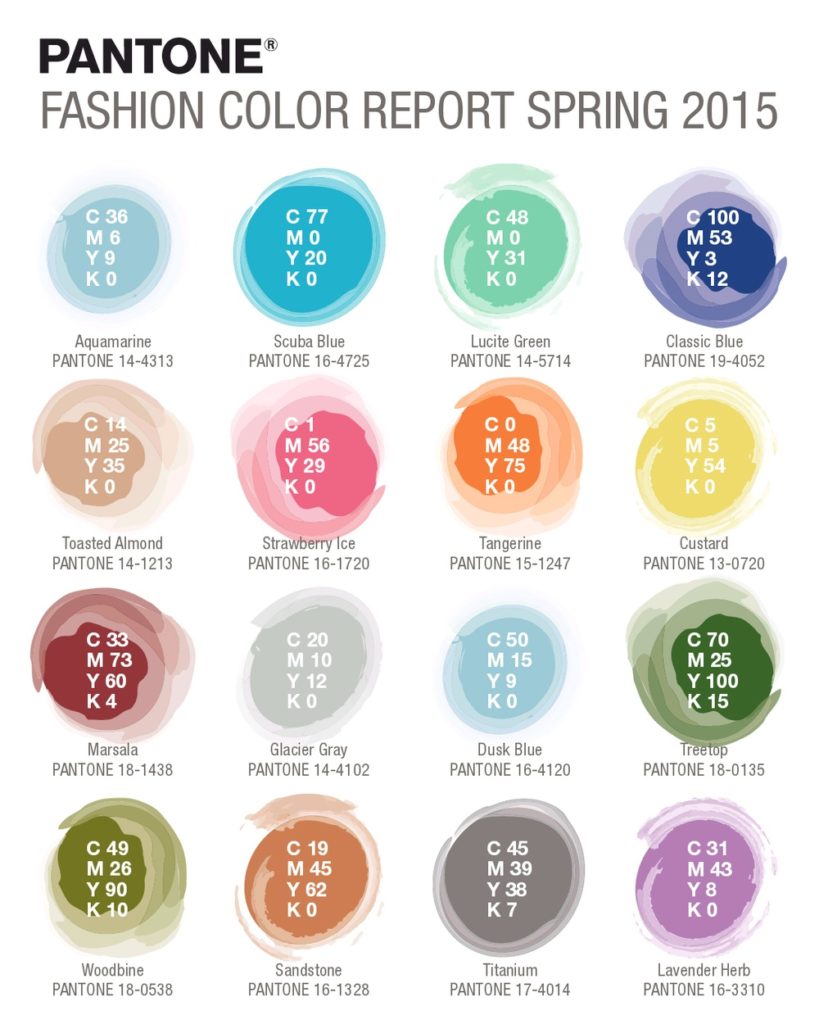
According to the Pantone® Fashion Color Report for Spring 2015, this season’s colour palette is moving towards a cooler, more naturally inspired spectrum using colours that are a subtle nod to retro minimalism and playfulness.
Leatrice Eiseman, Executive Director, Pantone Color Institute (think of her as the Anna Wintour of colour), talks about the selections of this palette, saying, “There is a growing movement to step out and create ‘quiet zones’ to disconnect from technology and unwind, giving ourselves time to stop and be still. Color choices follow the same minimalistic, ‘en plein air’ theme, taking a cue from nature rather than being reinvented or mechanically manipulated.”
The challenge you face if you align your paint colour with the popular look, is that you risk choosing a colour that is passé in a matter of months. Remember how in-vogue rust-orange was in the 70’s? This was quickly eclipsed by bold colours and prints in the 80’s – overtaken by the ethereal pastels of the 90’s.
However, the colours of this season are deeply rooted in timeless sensibility. Stylish trends versus fleeting fads. Eiseman says that the “soft, cool hues blend with subtle warm tones create a soothing escape from the everyday hustle and bustle.” We firmly believe that colour can have that effect on a space.
As you consider paint colour and design accents for a home design, remodel or build, ask yourself a few questions:
– What is the purpose of this space (Is it a working, family or utility space?)
– How do I want to feel when I’m in this room? (Relaxed, refreshed, warm, productive, etc.)
– What is the personality trait I want this space to embody? (Quirky, reflective, loving, strong, etc.)